Logo design is an essential part of any business, which show your brand identity. A professionally designed logo will help your customers to remember your brand. Each branding material with your logo shares your brand with the world. So, the custom designed and unique logo is your image.
Obviously, a good logo will differentiate your brand from the competitors. They can easily recognize your products and services when seeing your logo. But, there are a lot of business owners who don’t give a necessary importance when choosing a logo.
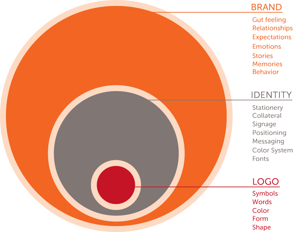
First of all, let’s see the differences between a logo, brand, and identity

WHAT IS LOGO?
The term logo is an abbreviation of the Greek word logotype. Logos means “word” and typos means “imprint.” It is a graphic representation of symbol, mark or emblem that used to promote public recognition.
MAIN TYPES OF LOGO
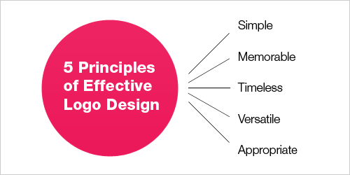
“As simple, as better” this approach to logo design is still in trend, especially today’s fast-moving environment. So, you should impress your customers with your stylish logo. It must be easy to the eye and for the brain to memorize.

So, the first question now you ask yourself is how to choose the best logo style for your business? Let’s start by exploring the main styles or types.
A. WORDS AND LETTERS (Lettermarks and Wordmarks)
Lettermarks logo also popular monogram logos, is a typography-based logo where you can meet a few letters, mostly the initial ones. This type of logo is about the simplicity. For the companies who have a long name, this type of logo is the most effective solution.
For example, NASA vs. the National Aeronautics and Space Administration
Wordmarks logos include only the name of the business. The great example of this is Google’s logo. Having a memorable name for the business you can combine it with the strong typography solution and create a professional logo for your brand.
So, WORDS & LETTERS can be used in logo when you:
- choose a distinct name for your business
- have a long business name
- start a new business and need to share it with others
B. PICTURES AND SYMBOLS
Pictoral marks and symbols which is also popular as brand marks are graphic based solutions including an image that you associate with your brand. For example, Apple, Twitter etc. Today’s popular brands show that a true mark is only an image. The most important factor is to choose a right image for your business.
Abstract logo marks are also pictorial images based on an abstract geometric form that represents your business. This form of logos allows you to create a unique logo for the brand. Through colors and abstract form, you can cultivate emotion around your brand.
Mascots logos are colorful, fun and often cartoonish solutions. Choosing this style you choose a character who will demonstrate your brand. Great examples of mascot logos are Kool-Aid Man, KFC’s Colonel and Planter’s Mr. Peanut. In addition, the companies choose a mascots logo to attract children and families.
So, PICTURES & SYMBOLS can be used in logo when you:
- have an established brand
- provide global commerce solutions
- offer services or products in the international market and your brand name is difficult to translate
However, you should avoid choosing pictorial mark as a logo, if you not sure in your future plans. Supposing you enlarge your business and starting to offer different products, then your logo symbol can’t totally bring whole your activity to the client.
C. COMBINATION
The name already shows the idea of the future logo. Combination mark is composed of letters, words, pictures etc. It is a combination of typography and graphic design solutions. So the best examples of this logotype are Doritos, Lacoste etc.
Another popular type of combination logo is the emblem. Generally, an emblem logo is a combination of font, symbol or icon. This type of logo is very used by schools, organizations, government agencies. Some popular companies like Starbucks, Harley Davidson, and others have changed and modernized their old emblems with contemporary stylish design and get the perfect look.
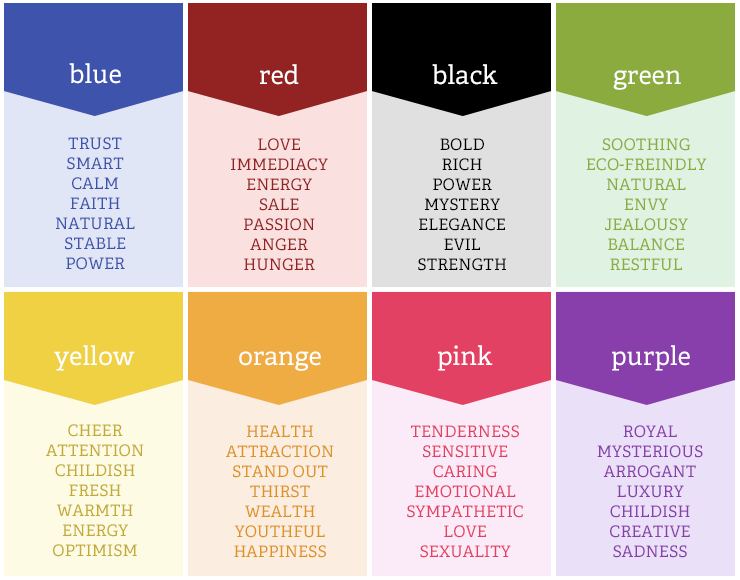
Research has shown that people make subconscious judgments about a person, environment, or product within 90 seconds of initial viewing. Between 62% and 90% of that assessment is based on color alone. This means that your logo could make or break a consumer’s decision to become a customer or clients
- Source: Emerald Group Publishing Limited
The meaning of colors for logo design

HOW CAN WE HELP YOU
In brief, a logo is the most important design element in your business which demonstrates your companies values. It is absolutely necessary to take into consideration the needs and preferences of the audience before creating a logo. At InExpanse.com our creative team of designers will create custom and professional logo for any industry.
REQUEST FOR A LOGO DESIGN SERVICE
In conclusion, ready to discover the colors and shape opinions for your business? Please fill out the request form here. In addition, check the services you are interested in and we’ll review your quote immediately!

